How to Build a Multi-Platform Social Media Dashboard with One API Layer

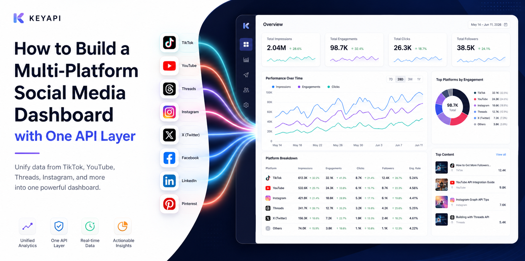
Most teams do not struggle because they lack data. They struggle because their data lives in too many places, uses different definitions, and reaches different teams in different formats. TikTok, YouTube, Threads, and Instagram may all be part of the same marketing workflow, but the reporting experience usually feels fragmented.
That is why many teams eventually move beyond isolated exports and native dashboards. They start looking for a unified social media API workflowthat can support one reporting layer across platforms. If the goal is not just to collect raw metrics but to build a dashboard people actually rely on,KeyAPI.aican help simplify multi-platform data access and reduce the time spent stitching reports together by hand.
Why most cross-platform social media dashboards fail
A lot of dashboards fail for a simple reason: they were built to display data, not to answer decisions.
Teams often connect several APIs, push numbers into a dashboard tool, and assume the problem is solved. In practice, that usually creates a cleaner-looking version of the same confusion. One platform counts views one way, another reports engagement differently, and a third updates metrics on a different schedule. The result is a dashboard that looks complete but does not help people trust what they are seeing.
A multi-platform dashboard starts to break down when:
every platform uses a different metric definition
different teams rely on different exports
historical data is not stored consistently
the dashboard shows too many numbers and not enough context
no one agrees on which metrics actually matter
The issue is rarely the chart itself. The issue is the reporting logic behind it.
What a multi-platform dashboard should actually help teams see
A useful dashboard should make it easier to answer business questions, not just display platform data in one place.
Leadership needs a clear performance view
Leaders usually do not need every post-level metric first. They need a reliable overview that shows where momentum is building, where performance is slipping, and which channels are contributing to larger business goals.
That means the dashboard should make it easy to review:
platform-level trends over time
audience growth direction
engagement movement
major changes in content output
the gap between activity and business impact
Content and marketing teams need operational visibility
Content teams need to understand what is working now, not just what worked last month. A usable dashboard should help them compare publishing output, content response, and format performance without forcing them to jump between five platform backends.
This is where a stronger social media analytics API workflowbecomes useful. It gives teams a cleaner way to review trends across platforms instead of rebuilding reports from scratch every week.
Monitoring teams need signal, not noise
A dashboard should not only support reporting. It should also help teams see early changes in performance, mentions, and unusual spikes before they become harder to explain later.
That is where monitoring matters. If your workflow also depends on catching changes early, this should work alongside a social media monitoring API approachrather than replacing it.
Which metrics can be standardized and which cannot
This is where many teams make the wrong assumption. Not every metric should be forced into the same definition.
Some values can usually be standardized across platforms well enough for trend reporting. Others should stay platform-specific.
Metrics that usually work well for cross-platform reporting
These are often useful for broader comparisons:
publishing volume
engagement trend direction
audience growth over time
post frequency
relative content performance
top-performing content by period
These metrics are not perfectly identical across platforms, but they can still support decision-making when definitions are documented clearly.
Metrics that should be treated carefully
These usually cause problems when teams compare them too aggressively:
views
reach
impressions
watch time
engagement rate
audience quality
click behavior tied to platform-specific actions
The goal is not to pretend every platform works the same way. The goal is to create a dashboard that helps people compare trends responsibly.
How one API layer simplifies dashboard reporting
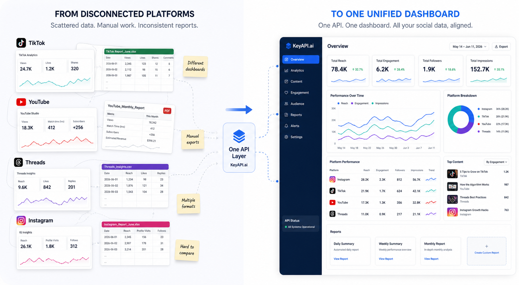
Once a team reaches the point where reporting depends on several platforms at the same time, the real problem changes. It is no longer just about getting access to one more endpoint. It becomes a question of workflow, consistency, and maintenance.
One collection layer reduces reporting friction
Without a shared layer, teams often end up with separate scripts, separate exports, and separate logic for each platform. That may work at small scale, but it becomes difficult to maintain as reporting grows.
One API layer helps reduce that friction by making it easier to:
centralize multi-platform data collection
standardize field naming
keep reporting logic in one place
reduce duplicated manual work
build more stable dashboards over time
Historical snapshots matter more than people expect
A dashboard is only as useful as the history behind it. Many teams discover too late that they collected current metrics but did not store them in a way that supports trend analysis.
If you want a dashboard that actually explains change over time, you need a workflow that preserves snapshots consistently. Otherwise, the dashboard becomes a surface for current numbers, not a tool for understanding performance.
H3: Shared data logic improves team alignment
One overlooked value of a better dashboard layer is internal alignment. When marketing, content, commerce, and support teams all work from different exports, arguments about performance usually start before analysis even begins.
A stronger reporting layer gives teams a better chance of working from the same definitions, the same update logic, and the same view of change over time. That is one of the reasons teams move from disconnected tools toward a platform like KeyAPI.ai.
What to fix before you build another dashboard
A new dashboard will not solve a broken reporting workflow by itself.
Before building another view, most teams should pause and check a few things first.
Define the decisions the dashboard should support
If the dashboard cannot answer a clear question, it will turn into a wall of numbers. Start with the business decisions it needs to support:
which channels deserve more attention
which content formats are gaining traction
where audience growth is slowing
where performance changes need investigation
how platform activity connects to larger business outcomes
Reduce unnecessary metrics
More data does not automatically create more clarity. A dashboard becomes harder to use when it tries to show every available number from every platform.
Useful dashboards are selective. They focus on the few metrics that help teams notice change, compare direction, and take action.
Separate reporting from monitoring
Reporting and monitoring should support each other, but they should not be treated as the same thing.
A reporting dashboard helps teams review performance over time. A monitoring workflow helps teams catch changes as they happen. When those two jobs are mixed together without a plan, the result is usually cluttered and harder to use.
When native platform tools are still enough
Not every team needs a unified dashboard layer immediately.
If you only manage one platform, run a small account, or review performance occasionally, native tools may still be enough. The need for a multi-platform dashboard usually becomes more urgent when:
several teams need the same reporting view
multiple platforms are already active
weekly or monthly reporting is becoming manual and repetitive
leadership needs a consistent top-line view
the business wants trend analysis instead of isolated snapshots
That is usually the point where a unified social media API workflowstarts to make more sense than another patchwork of exports and scripts.
Final thoughts
A good multi-platform social media dashboard does not begin with charts. It begins with structure.
The teams that get the most value from dashboard reporting are usually not the ones collecting the most raw data. They are the ones that decide what needs to be measured, which metrics can be compared responsibly, and how to keep reporting logic consistent across platforms.
If your team is already working across several channels and spending too much time reconciling exports, a unified data layer is often the point where reporting becomes easier to trust, easier to share, and easier to act on. That is the real reason teams start building with tools like KeyAPI.ai.